Tuesday, 22 October 2013

PSS Peer Mentoring

Anders Poulsen
http://anderspoulsen.blogspot.com.au/2013/10/project-2-sustainable-product-service.html?showComment=1382448659232

The idea of making it a question mark is ingenious, I like it! 
Maybe with some attrctive color, it is easier to discover especially when placed at tourists spots with huge crowds.

Ole André Bech
http://bechdesign.blogspot.com.au/2013/10/final-presentation.html

Good work, I like your idea very much, especially the way how siesta is folded and opened, which is very convenient and space saving. The only question is whether it is a good place to choose Bars and clubs as they are not likely to be located near work places. So it may be a problem that people need to go for a while to get to nearest siesta.

Jan raymond
http://janraymondgerardino.blogspot.com.au/2013/10/sustainable-product-service-system.html
Good idea to get to more public attention, and your poster illustration is clear and logical, quite convincing. Only a small suggestion, you can made the hero shot with a little more perspective so that the machine would look more real and appealing.

Ricky Chu
http://starocean01.blogspot.com.au/2013/10/wk12.html?showComment=1382450428716
Like your idea very much as making a mobile battery so tiny. Again I agree with a above comments saying the plug it is fragile. Maybe putting it at the other end with a cap would be safer. Besides, I don't think the android phones share one standard of charging plugs, maybe Windows phones either.

Qiuyuan Lin
http://haresama.blogspot.com.au/2013/10/project-2-final-posters.html?showComment=1382455535492
Great idea to offer mobile emotional therapy. I just suggest removing the big screen and keeping the sensors and the bluetooth, paring bracelet with your phone via bluetooth when an app on your smartphone is just capable to do the job. Otherwise, the battery is hard to last long and the user may find wearing it tiring as too many components actually weigh a lot. 
Your posters are of great layout and look so professional, love them!

Monday, 2 September 2013

Project I: Accessible Packaging Peer comments


Ole André Bech


http://bechdesign.blogspot.com.au/2013/09/final-concept.html#comment-form
well done. I do like the opening mechanism, it's simple and efficient, not only for the vision impaired people, but for normal people as well.
The shape of the sheet is also beautiful, but May I recommend adopting more volume-efficient shape for the tablets, as there is no need for vision impaired people to appreciate the aesthetics of curves or geometry.


OLIVIA QIUYUAN LIN


http://haresama.blogspot.com.au/2013/09/studio-3b-project-1-final.html
The shape of the package is cute enough for kids. I believe they are willing to use it. what I liked the most is the cap, it will not get lost by kids who are always careless in their age. what may be a concern is that the bottle is little bit small, so it may be hard to squeeze when it is running out


ping song

http://pings19.blogspot.com.au/2013/09/week5.html#comment-form
I like the elegant shape of your bottle design although it means little to vision impaired people. The idea of controlling amount of detergent is great. The only suggestion is add grip texture on the bottle so that it can be hold more easily


Edric Verbeek-Martin

http://edricides3222.blogspot.com.au/2013/09/project-1-final-submission.html#comment-form
the design of hanging is brilliant, I always hate when the lotion bottle falls down on the floor. But I feel more like to squeeze from the side rather than the top. may be the top can be more indicating

http://mabenjamin.blogspot.com.au/2013/08/accessible-packaging-milk-container.html
I liked the idea of the cap and the elegant shape. however the bottle hasn't given much indication on pouring without fingers...


Tuesday, 27 August 2013

LCA Report


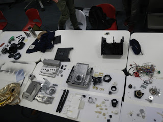
The product we teared down, a coffee maker, was manufactured in China. Through out the whole life cycle, the use of the product generated most impact on environment in terms of energy use and water usage. In the long term use such as more than ten years, the coffee maker use electricity and water to produce coffee every day, compared to the short period of manufacture, this phase of life cycle don't need any more material supplements. Hence, to make this coffee maker more green, one should focus more on the way of coffee making, trying on reducing the energy consumption when heating and grounding coffee. In this case, increasing the efficiency of heating and grounding would become the main issue that need to be solved.

However, there is a another problem of this coffee maker. The material usage of the coffee maker can be cut down a little such as the decoration shield outside out of aluminum..etc. as it is still quite a heavy product. Cutting down the material usage not only helps in reducing energy consumption in the phase of manufacture but also help losing weight. Given the consideration on the distant transportation from China to Australia, lower weight and smaller volume will give much help in cutting down the fuel consumption and further the CO2 emission.  


In short, products like coffee maker usually lasts really long in daily run and their is not always a need of replacement unless it breaks. Hence, for designers, personally, I think what we can do is trying to use less material as possible. And for users, One should really care more on their coffee maker in order to expand its life.